
Project: A print ad promoting Tim Hortons Strong (spec).
Challenge: Market a new dark-roast blend of coffee to Canadians between the age of 25-50 in major cities. Target current yet infrequent customers. Overcome resistance to change.
Solution: Tim Hortons fans are incredibly loyal to the brand. The flavour of Tim Hortons coffee is as much a part of this brand loyalty as are their donuts. Introducing a new dark roast flavour (keeping up with other coffee purveyors, including McDonald’s) is a risky endeavour considering the ferocious loyalty that exists for their traditional product (see: New Coke).
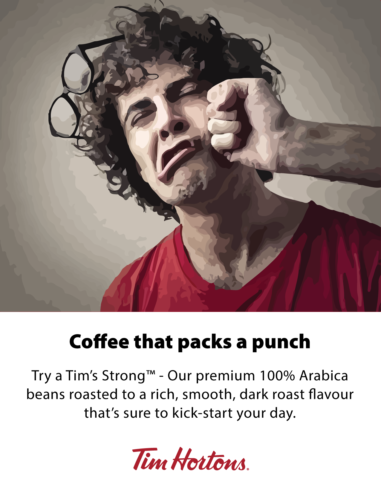
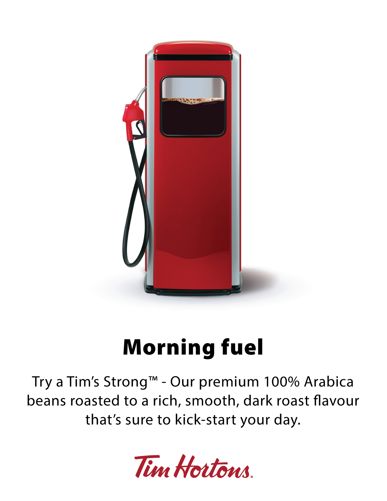
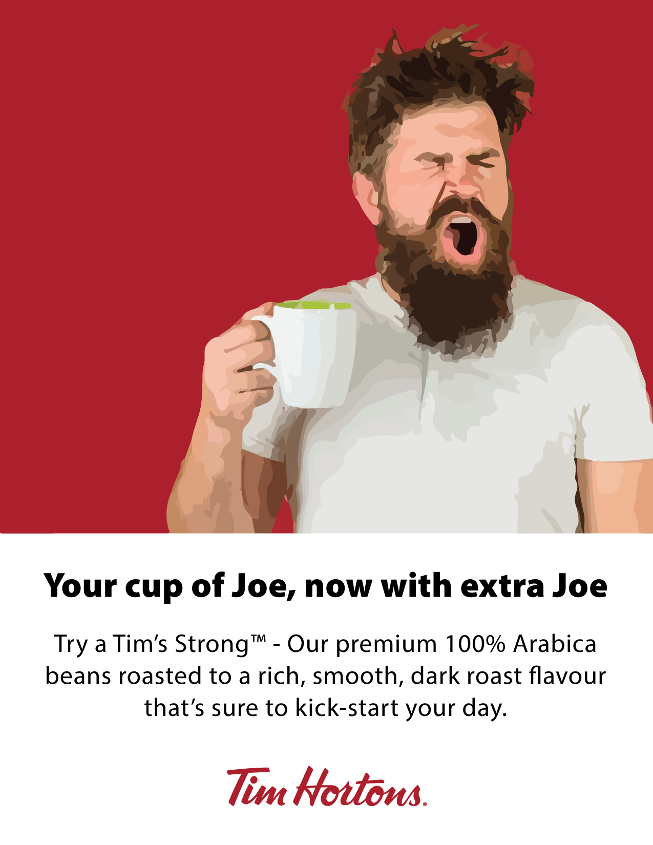
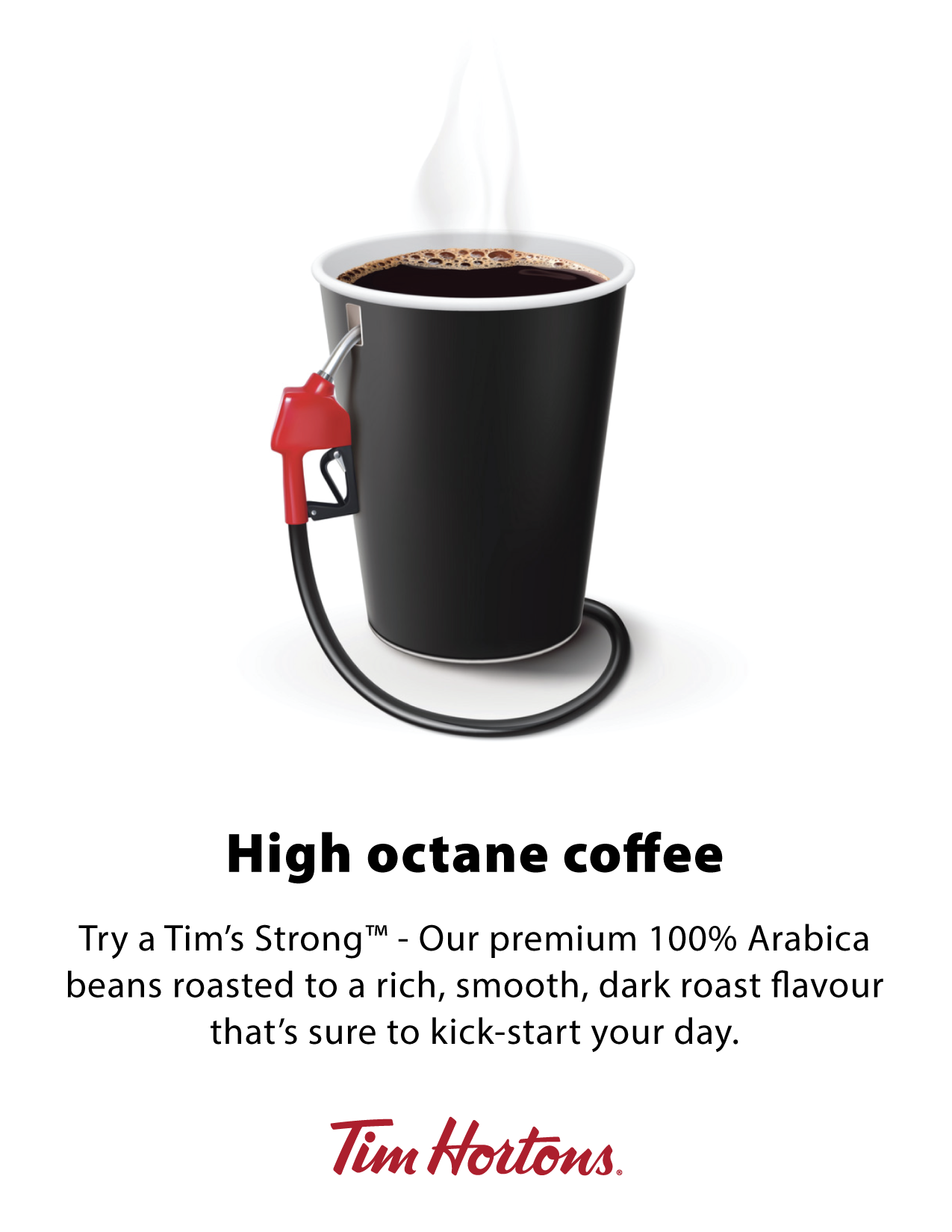
The proposal was to position the new dark roast coffee not as a high-end, new variety, but as a more extreme version of the original - Instead of calling it dark roast, this campaign would name the product offering ‘Tim’s Strong’. A series of images leaning into the stronger flavour (and nodding to the ‘salt of the Earth’, blue-collar, hockey-loving patrons courted by Tim Hortons) are intended to wave a red cape at a younger demographic, daring them to prove themselves as strong enough Tim Hortons fans by adopting a more extreme version of the original.
Design Notes: Logo © Tim Hortons, stock images © Shutterstock, Freepik.com, Getty Images.